Randy Sincoular | Geospatial Professional

Experienced.Innovative.Thorough

Portal Apps and Map Services

Portal for ArcGIS was deployed to make it easier for users to consume and share maps and data. One of the first maps users wanted to see were electric and gas outages.

Portfolio Item #2


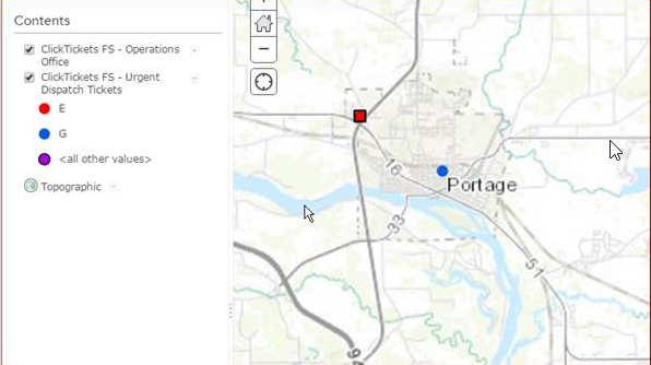
The first challenge was to take tickets, or work orders, created for urgent gas or electric incidents and be able to display these in a Portal application. These tickets are called in by customers and then sent electronically to field technicians using a mobile application from ClickSoftware.

Here is a summary of the steps required to display the data in Portal:

  • The tickets reside in a SQL Server 2008 R2 database. The GIS uses an Oracle 12 Exadata database. I had our DBA create a view of the urgent tickets on our GIS Oracle database.
  • Create a feature class in the GIS database to store the Click ticket locations. The coordinates for the ticket locations are in decimal degrees so a WKID Spaial Reference of : 4326 was used.
  • ST_Geometry was used for the shape data type. I like this data format. You can use SQL to create the point features on the fly. No need to use ArcObjects or other API's to create the point feature locations. Very slick!
  • Data never seems to be in the exact format you want. The Latitude/Longitude data needed to have a decimal point added because the ClickSoftware application didn't use it.
  • Once the GIS feature class was created, a feature service was created in ArcGIS Server. Next step is to automate the process of refreshing the data on a regular basis.
  • A combination of Python and SQL scripts were used read the data from the Oracle view and insert it into a temporary GIS feature class/Oracle table. Once the temporary feature class has been updated, the source feature class is truncated and re-loaded with data from the temporary feature class. A process that takes less than a second.


  • Portfolio Item #2


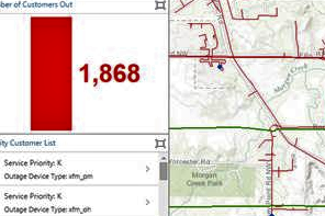
    This is an Operations Dashboard showing Electric Outages. Operation Dashboards provide a Read Only view of the data. What is nice about the dashboards is you can have charts, guages, and graphs to give users a quick picture or synopsis of the data they are viewing.

    In the screenshot, there is a graph that shows the total number of customers without power. There is another graph on the bottom that shows the number of Priority Customers without power. Priority customes can be Key Customers (K), customers like a Police Station, Sewerage Plant, etc. Life Support (L) customers rely on power for medical equipment.

    The Electric outage data resides in a different Oracle database than GIS. The process for creating the Electric Outage points is similar to how the urgent gas and electric tickets were created above.